A few times last month I volunteered to grab the garlic, or an onion for dinner at the farmers market down the street. And maybe I had ulterior motives. and maybe that trip also included a quick stop to the Salvation Army that's just a couple blocks down.
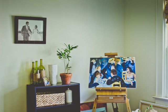
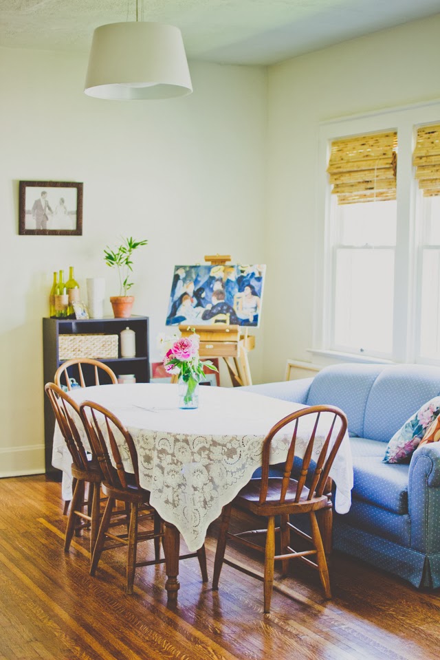
The home we're in now is much larger than the homes that we lived in before, so that means more space to fill. I wish we had the means to buy cool art pieces, but for now these thrift finds will do.
My new favorite thing is to upgrade the pieces that I find at the thrift store or yard sales. Sometimes I find a gem that's lovely and doesn't need any sprucing. However, most of the time I find a lot of bad or just ok art.
When looking for a piece to work with:
I look at the frames first. A lot of times the frame, especially vintage will be more valuable that the art itself.
I check to see if it's a real canvas. Our salvation army has a lot of the fake canvas and texture, over-produced kind of pieces. Which is what I used here, above is the original.
I ask myself if there is a place for the art. I try to be careful about mixing in some of my finds with other mediums and try to have a place for them, so they don't take up space in storage.
I also look at the size for similar reasons above.
Here's how I went about creating this abstract artwork:
I primed the canvas. I had a lot of blue, so I just covered the original artwork with a coat of paint.
I think of a happy memory, in this case a hike to a waterfall.
I don't look at a photo, I just try to capture the essence of the memory.
I try to do the initial layer (above) quick, that way I get just the key things in, sometimes less is more.
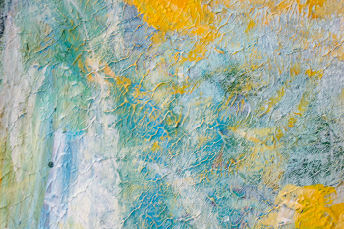
Since this is an abstract piece, it's not meant to be realistic. So I focus also on creating shapes and lines that I find interesting and help give the illusion of the waterfall and a faded memory.
I picked a color scheme. Colors that are cooler and close to each other on the color wheel (analogous colors) I also like these colors, especially yellow.
Mix colors. To make a piece look truly unique, it's best to mix colors. Sometimes I am lazy and don't and other times I mix a color with it's complement (green with red) to tone it down.
I add layers. I continue to add more dimension to the forms and colors that are there.
Lastly, I went over this with a wash of white paint and yellow.
I also add some little marks with a small white brush, which are a little hard to see. Some lines and some dots to add a little whimsy.
I don't mind the texture that was original to this piece. I really like the way it turned out.
In the end, I have an original artwork that is personal to me. Even Jordan noticed right away that this was a waterfall and was able to enjoy the artwork despite his dislike of abstract art.
The fun thing about abstract art is that it is up to your interpretation of shapes, colors, and lines. You can create your own abstract artwork and it can look completely different.
What do you think? Would you be interested in seeing the rest of my finds? or more art related posts? The art teacher in me really loved writing this post. Though I tried my best not to throw out to much art verbage. :)















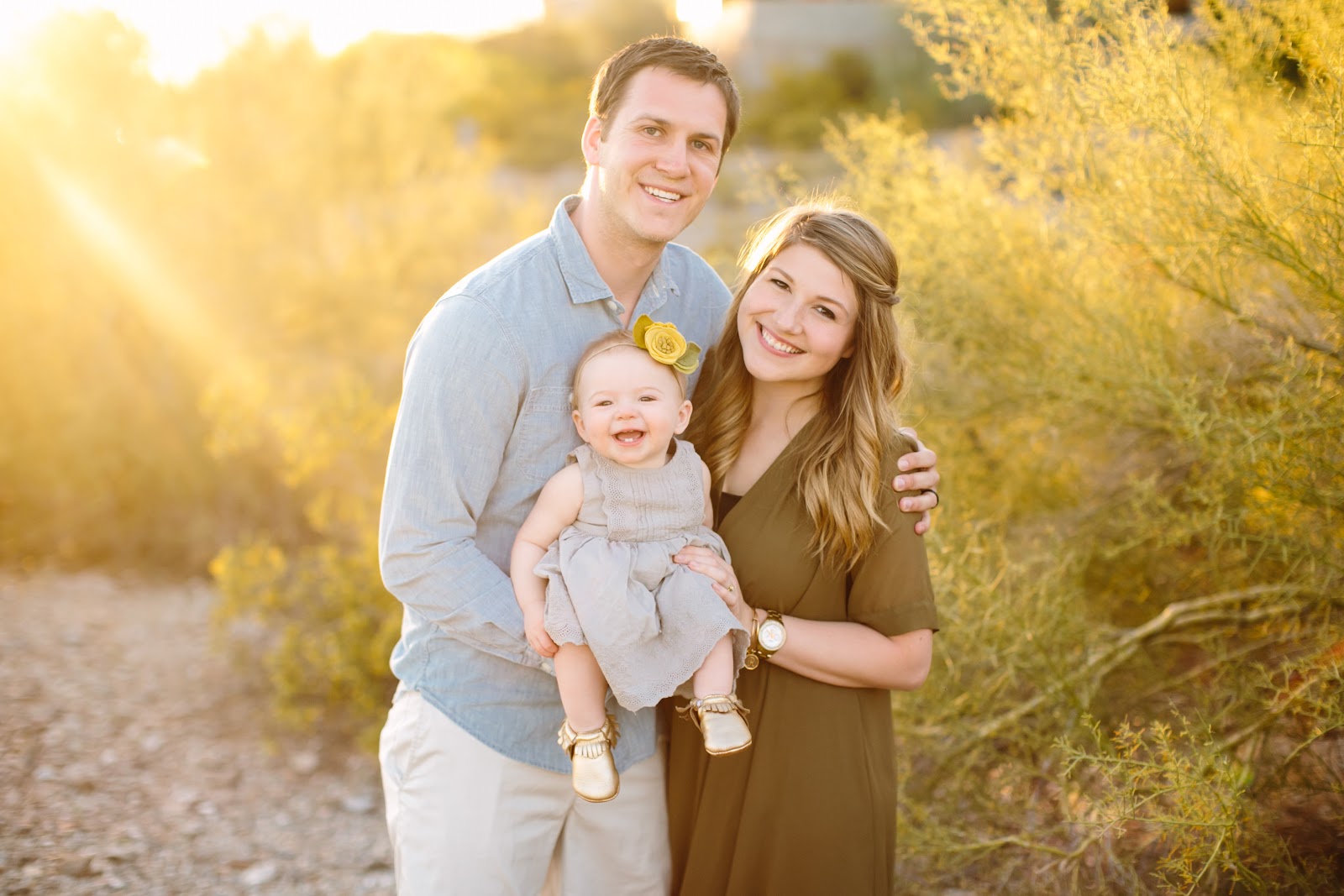 I'm Katelyn, a creative who finds beauty in the little things. I like the windows open and vases filled with flowers. I photograph and write about the mostly small but sometimes big adventures we find in our daily lives.


